Tidyverse
Tidyverse
The tidyverse is a set of packages in R that share the same programming philosophy. These packages are
readrtidyrdplyrggplot2magrittr
All these packages provide different functionalities. They can all be loaded at once by loading library(tidyverse). The combination of these packages provide an easier ‘front end’ to R. The tidyverse packages streamline the process of data manipulation compared to base R, as well as providing additional functions to simplify plotting and visualisation. This portfolio will go through an example demonstrating the usage of functions from these packages.
Example: Energy Output from Buildings
This dataset was obtained from the ASHRAE - Great Energy Predictor III. It is a large dataset that contains information about energy meter readings from 1448 buildings, which are classified by their primary use (e.g. education), their square footage, the year they were built and the number of floors they have. Meter readings are taken at all hours of the day, and these are available for a long time period for each building separately.
This dataset is very large, the train.csv training dataset file is around 386Mb, and so some processes can be very slow and cumbersome using base R functions. This is a good example of using functions from dplyr and magrittr to manipulate the dataset.
Joining and Structuring Data
We have two datasets to start with - train and metadata, which are the training set data and the building metadata respectively. We can inspect what kind of variables are in these datasets initially by using base R functions.
head(train)## building_id meter timestamp meter_reading
## 1 0 0 2016-01-01 00:00:00 0
## 2 1 0 2016-01-01 00:00:00 0
## 3 2 0 2016-01-01 00:00:00 0
## 4 3 0 2016-01-01 00:00:00 0
## 5 4 0 2016-01-01 00:00:00 0
## 6 5 0 2016-01-01 00:00:00 0head(metadata)## site_id building_id primary_use square_feet year_built floor_count
## 1 0 0 Education 7432 2008 NA
## 2 0 1 Education 2720 2004 NA
## 3 0 2 Education 5376 1991 NA
## 4 0 3 Education 23685 2002 NA
## 5 0 4 Education 116607 1975 NA
## 6 0 5 Education 8000 2000 NAThe first goal is to combine these data sets together, and we can see that both data sets share the building_id column, so these data sets need to be joined together by this. In base R, some combination of the match function and subsetting would be required to do this, involving multiple lines of code and maybe some confusion. With the right_join (or left_join) function from dplyr, the process is much simpler.
new.train <- train %>% right_join(metadata, by = "building_id")The training data set has been updated in one line with the function right_join, and it now includes the columns from both train and metadata.
colnames(train)## [1] "building_id" "meter" "timestamp" "meter_reading"colnames(new.train)## [1] "building_id" "meter" "timestamp" "meter_reading"
## [5] "site_id" "primary_use" "square_feet" "year_built"
## [9] "floor_count"When joining the data sets, the command %>% was used. This is referred to as a ‘pipe’, and is a part of the magrittr package. It iteratively performs operations such as the ones demonstrated above. In this case, it took the first input train, a dataset, then performed the function right_join, of which the first argument of the function was automatically defined as train. Pipes are very useful in organising and structuring code, and allow you to neatly run a lot of commands in one line.
Now, imagine that we wanted to look at the average meter reading for each type of building, grouped by respective primary use, at each hour of the day. We first need to restructure our data slightly to achieve this. Since our timestamp column is a string containing the date and the time of the meter reading, we can subset this to just the first two characters of the time, which are in positions 12 and 13.
new.train$time = as.numeric(substr(new.train$timestamp, 12, 13))This has created a new column in the new.train dataframe which corresponds to which hour the meter reading was taken. Now we can pipe the group_by and summarise functions through new.train to average over the different type of building and the time of day.
meanreadings = new.train %>% group_by(time, primary_use) %>%
                    summarise(mean=mean(meter_reading))
meanreadings
## # A tibble: 384 x 3
## # Groups: time [24]
## time primary_use mean
## <dbl> <fct> <dbl>
## 1 0 Education 4488.
## 2 0 Entertainment/public assembly 448.
## 3 0 Food sales and service 335.
## 4 0 Healthcare 757.
## 5 0 Lodging/residential 271.
## 6 0 Manufacturing/industrial 273.
## 7 0 Office 484.
## 8 0 Other 127.
## 9 0 Parking 183.
## 10 0 Public services 264.
## # … with 374 more rowsNote that this has resulted in a tibble, which is a form of a data frame. The same goals can be achieved with a tibble that would otherwise be achieved with the normal dataframe type.
Plotting and Visualising Data
To visualise the average meter readings over the course of the day, we can use the ggplot function, from the ggplot2 package. This is a plotting package that provides easy access to different types of graphics. It also allows structure within plots, as you can save a plot object as a variable. Additions to the plot can done by simply adding other layers to the existing object. This can be seen in action here.
pl <- ggplot(meanreadings) + geom_line(mapping = aes(time, mean, col=primary_use), size=1.5)Initially, the ggplot function was called on the data frame meanreadings, initialising the plotting sequence, then the geom_line layer was added. The mapping argument defines what goes into the plot, so that time is on the \(x\)-axis, and mean is on the \(y\)-axis. The specification of col=primary_use in mapping separated the different categories and plotted their lines separately on the same plot. We can see the plot by inspecting the pl object.
pl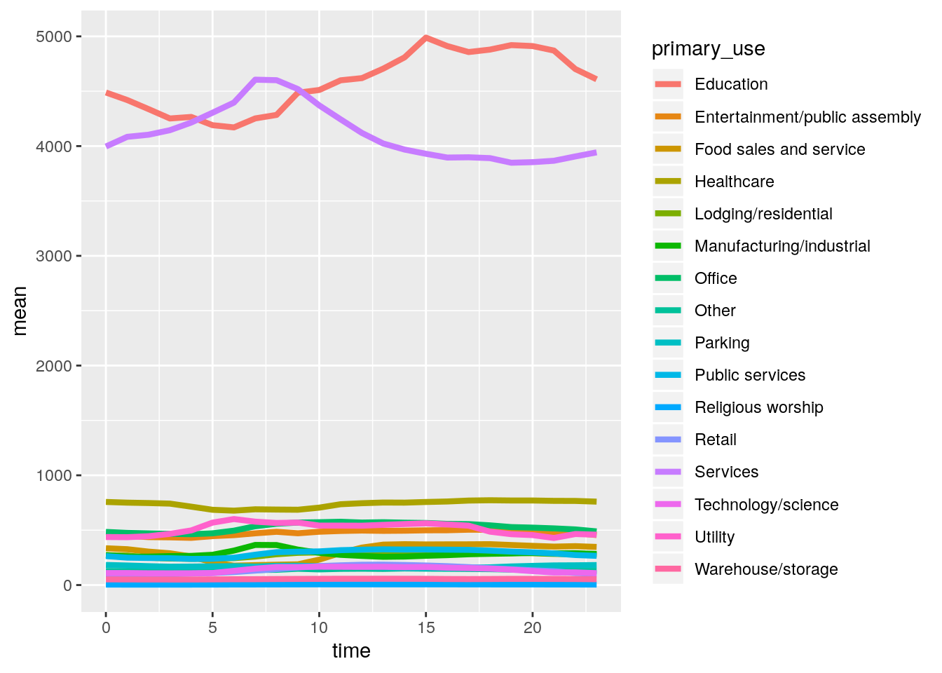 This is an interesting plot, but doesn’t tell us much about the variation in meter readings on average during the day, for each building type. It does show that the ‘Education’ and ‘Services’ types of buildings on average require a lot more energy (or just have higher meter readings). To look at the variation between building types more closely, we can normalise each building type to be centred on zero by subtracting the mean across the average day and dividing by the standard deviation. This can be achieved by first creating a new data frame which includes both the mean and standard deviation.
meanreadings2 <- meanreadings %>% group_by(primary_use) %>% summarise(mean2 = mean(mean), sd = sd(mean)) %>% right_join(meanreadings, by = "primary_use")
meanreadings2$norm.mean <- (meanreadings2$mean - meanreadings2$mean2)/meanreadings2$sd
ggplot(meanreadings2) + geom_line(aes(time, norm.mean, col=primary_use),size=1.5)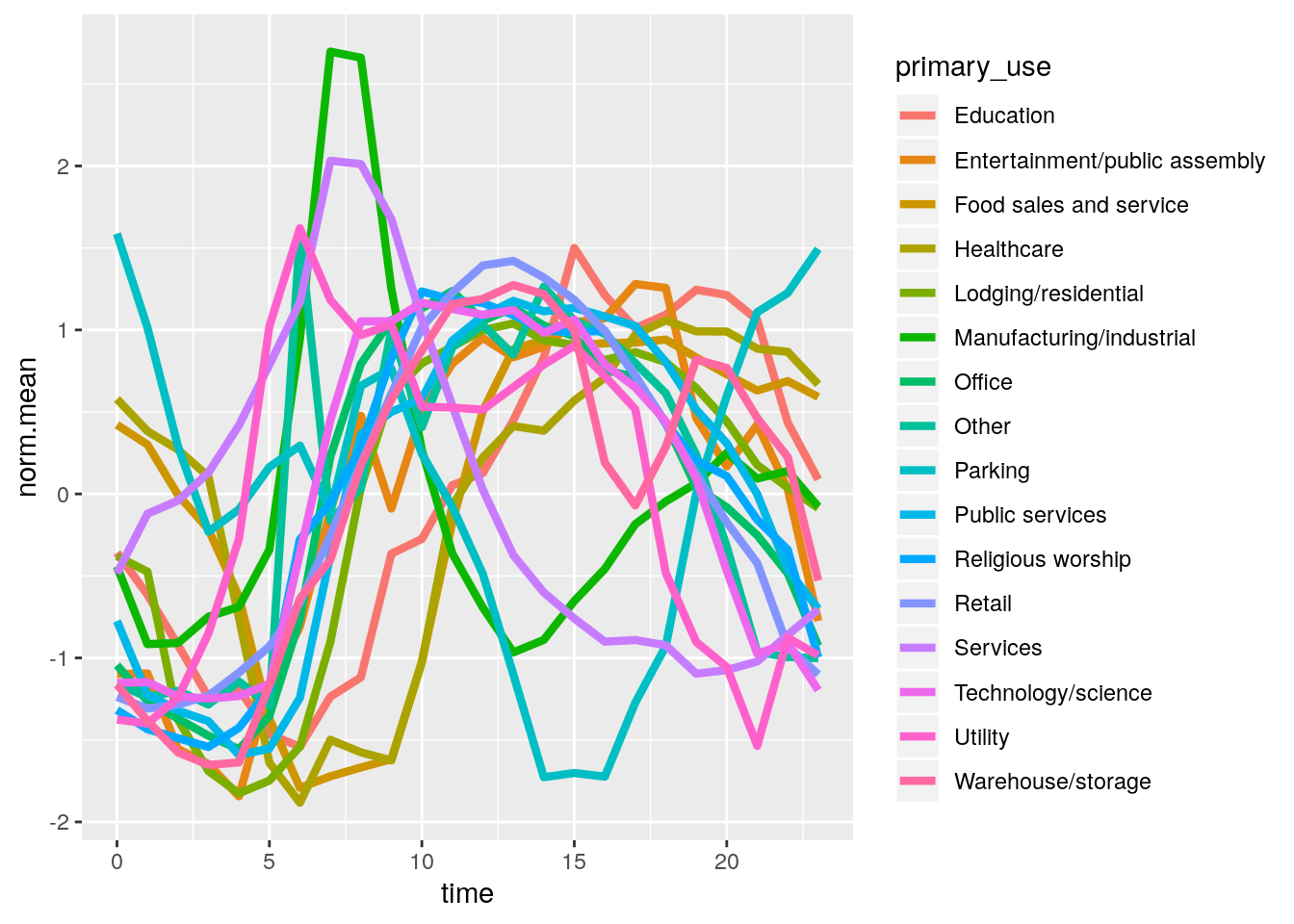
On inspection of this plot, we can make some interpretations about the mean daily temperature based on the primary use of the building. Most of these buildings seem to follow a sine curve, where the meter readings increase at midday at a time of around 0600 to 1900. The meter readings also seem to be periodic, as at the end of the day they finish at around the value they started at. Most building types follow the same periodic structure, but we can see that the Manufacturing/industrial category has a higher peak in the morning, and the parking category has a lower peak in the evening.
We can also split this analysis by season, and inspect how the season affects the mean meter readings per day. This can be achieved by first creating a new ‘season’ column in the original data frame.
new.train$month = substr(new.train$timestamp, 6, 7)
new.train$season = new.train$month
new.train$season[new.train$season=="02" | new.train$season=="03" | new.train$season=="04"] = "Spring"
new.train$season[new.train$season=="05" | new.train$season=="06" | new.train$season=="07"] = "Summer"
new.train$season[new.train$season=="08" | new.train$season=="09" | new.train$season=="10"] = "Autumn"
new.train$season[new.train$season=="01" | new.train$season=="11" | new.train$season=="12"] = "Winter"
Then by using the group_by, summarise and right_join functions, we will make a data set that is grouped by season, time and primary use, to go into a plot.
seasonal_readings <- new.train %>% group_by(season, time, primary_use) %>%
  summarise(mean_reading=mean(meter_reading))
seasonal_readings <- seasonal_readings %>% group_by(primary_use) %>%
      summarise(mean_mean_reading = mean(mean_reading), sd = sd(mean_reading)) %>% right_join(seasonal_readings, by = "primary_use")

seasonal_readings$norm.mean <- (seasonal_readings$mean_reading - seasonal_readings$mean_mean_reading)/seasonal_readings$sd
ggplot(seasonal_readings, aes(time, norm.mean, group=1,col=primary_use)) +
  geom_line(aes(group=primary_use), size=1.2)+
facet_wrap(~season) 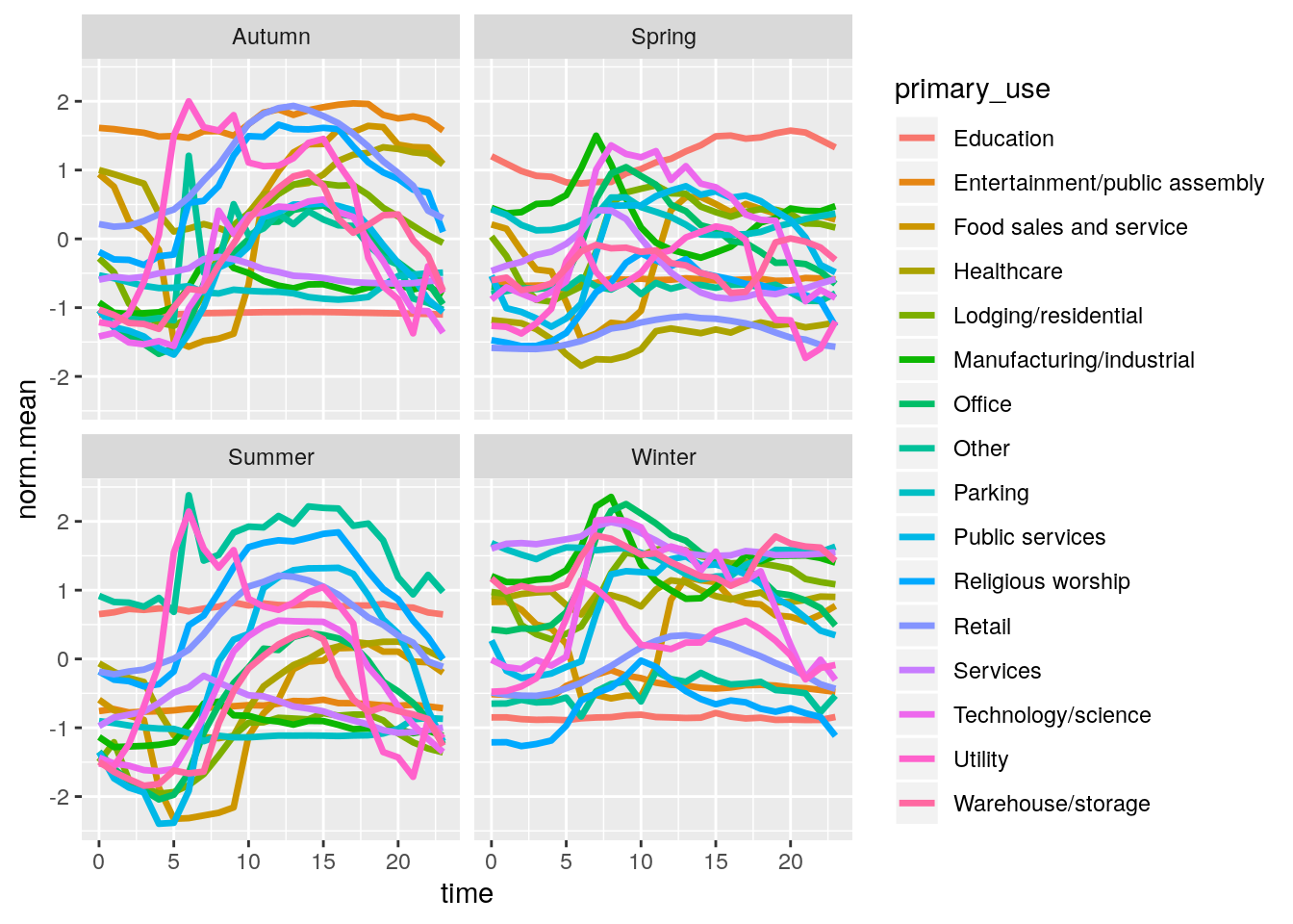
The first thing to note here is that the normalisation was done before the seasonal split, which is why some building types have higher normalised mean in some seasons. For example, we can see that the education category uses on average more energy in the summer than in other seasons. There is also a general shift upwards for meter readings in winter, and downwards for summer, which could be due to requiring more energy for central heating.